
Wootz
Forged by Fight
Wootz is a lifestyle street and MMA brand celebrating identity & heritage inspired by martial arts, Eastern philosophy, and Sikh culture. Wootz is named after a type of crucible steel characterized by a pattern of bands, which is commonly found on traditional panjabi weapons.Brand Identity / Art Direction / Print Design / Packaging
Updating the Brand
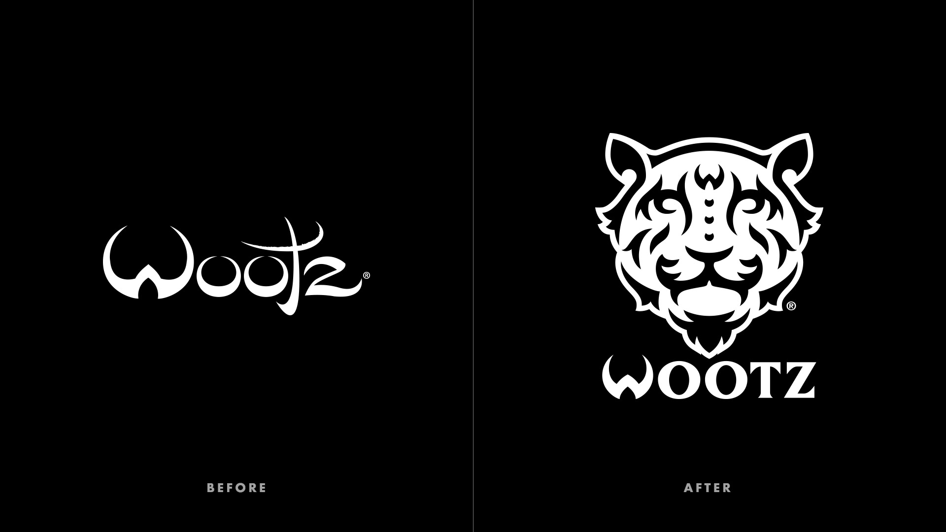
Their previous logo referenced sword blades, but its tapered edged proved difficult to produce on clothing at small sizes. In addition, Wootz wanted a strong symbol alongside an updated logotype to define the brand.
Logo Design
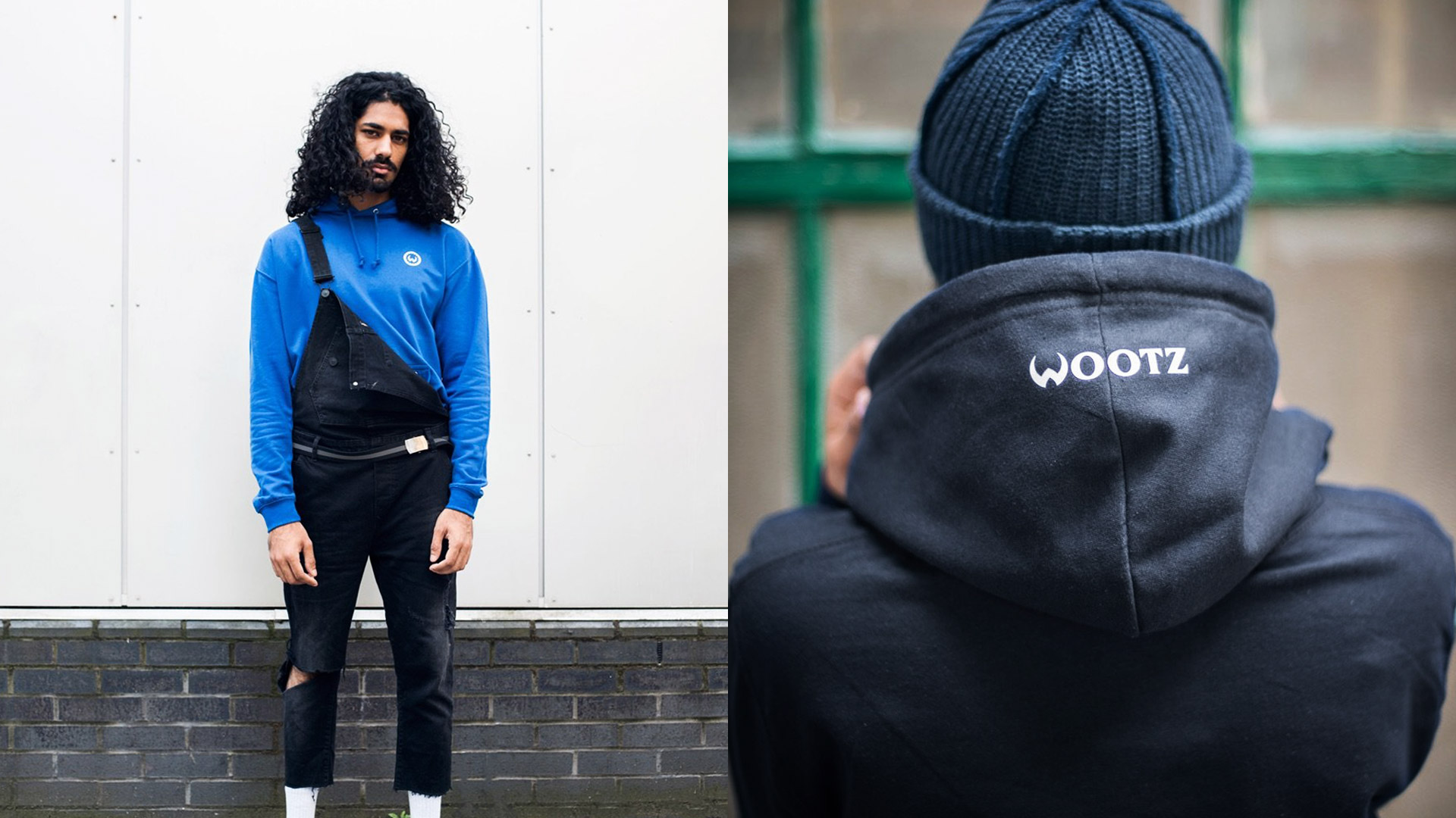
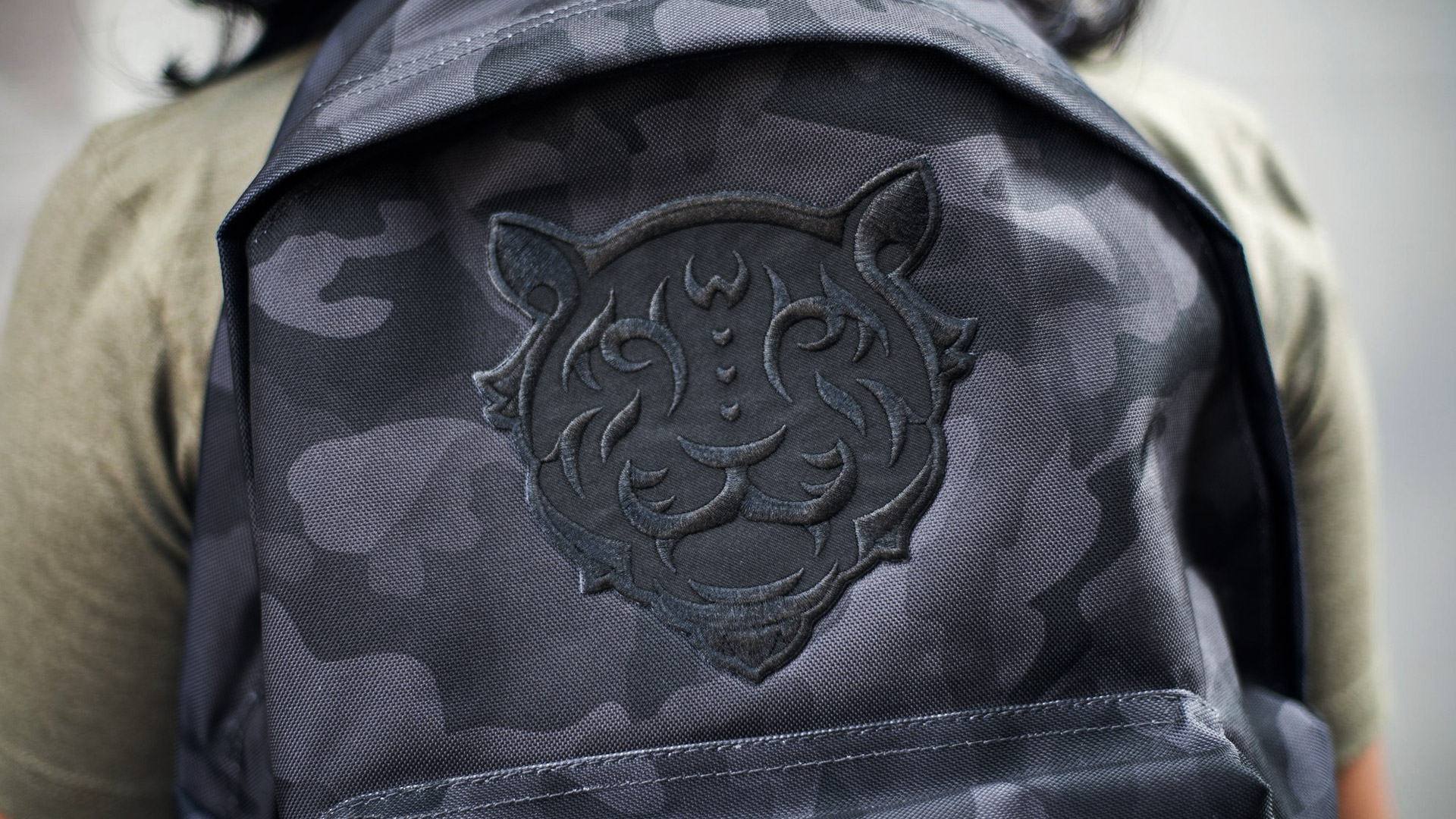
The logotype was beefed up and simplified while retaining its stylistic W and a hint of blade-like serifs. Along with a revised logotype, a tiger mark was created to represent the spirit of fight for a Wootz athlete. The tiger was designed to resonate a quiet strength with his calm but proud presence. The leaf-like stripes and jewels on the bridge of the nose allude to Tipu’s Tiger, an 18th century automaton created in India.


Credits
Client: WootzPhotography: Wootz
London, England
2016 – 2017
Press
Featured on Behance Graphic Design Gallery (November 29, 2017)Featured on Behance AIGA Member Gallery (December 20, 2017)
Featured on Behance InDesign Gallery (March 16, 2018)